
Weekly Anime Art Digest — Issue #1: June 2–8, 2026
Six standout pieces from this week's anime art community: an oil painting warrior, a character commission, a summer saturation study on ArtStation, a clean Kill la Kill portrait, a beach scene, and a mecha pilot design process. Plus style notes on what the week's work reveals.

This week's roundup pulls from r/ImaginaryCharacters, r/AnimeART, ArtStation, and the wider digital art community. Six pieces made the cut: a striking warrior in oil paint, a full-commit anime witch commission, a vibrant summer character study, a clean Kill la Kill fan portrait, a summer heat beach scene, and a mage character fresh from game development. Each is worth your time.
Pick of the week: "The Sacred Sword" by EskoArt
The piece that stopped the scroll this week came from u/EskoArt on r/ImaginaryCharacters.1 A red-haired warrior stands before a ruined stone arch at dusk, raising a blazing gold sword that throws light across her cloak and armor. The background is atmospheric oil painting — textured greens, a bruised purple sky — while the figure itself gets precise finishing on the metalwork.
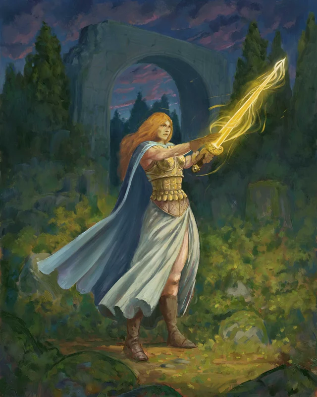
What makes it work is the energy distribution. The sword's light doesn't just hit the character — it bleeds outward, catching the grass and stone edges in soft gold. The pose reads confidently as a three-quarter swing rather than the static "hold sword up" stance that fantasy art defaults to. The cape sweep and the direction of her gaze reinforce a single action. Posted June 8.
コンテンツカードを読み込んでいます…
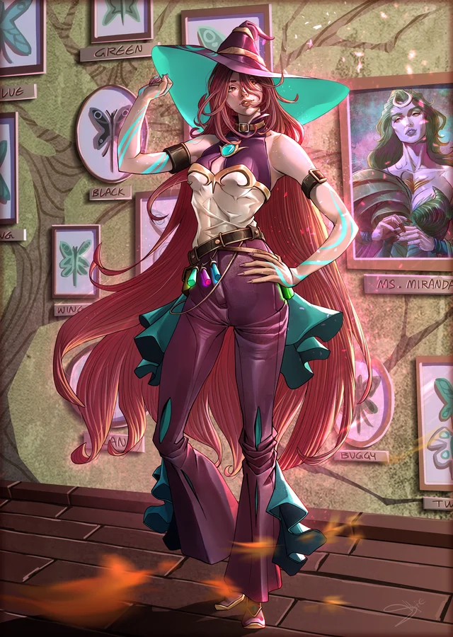
Commission spotlight: Kara Heartsteel by Saielazior
Artist Saielazior shared a completed commission of Kara Heartsteel on r/ImaginaryCharacters, posted June 8.2 The work uses the modern cel-shade approach that dominates character commissions right now: clean line art with controlled rendering on fabric and skin, a secondary glowing effect on accessories, and a background that's detailed enough to place the character without competing with it.
Kara Heartsteel is an original character design, not a franchise pull. That distinction matters for commission work — the artist has to invent the brief rather than reference existing materials, which shows in how specific the accessory design reads. The teal witch hat, the belt of crystals, the flared bell sleeves all have internal logic. The posters pinned to the wall in the background add narrative depth without cluttering the focal plane.
コンテンツカードを読み込んでいます…
ArtStation pick: "Vibrant Refreshment" by Imam Hassan
On ArtStation, Imam Hassan posted Vibrant Refreshment — a summer portrait piece built around the challenge of maximum saturation without the palette going muddy.3 Pink hair, glowing magenta irises, a layered tropical drink in the hand. Every element is pushing toward maximum saturation, and Hassan pulls it off by keeping the skin tones warm-neutral as the anchor.
The technique here is worth noting. Highly saturated pieces typically lose legibility as the eye has no "rest point." Hassan solves this by keeping the white background and the character's light shirt as low-saturation zones, letting the hair and drink carry the color load. The result reads as deliberately summery rather than accidentally bright.
コンテンツカードを読み込んでいます…
From r/AnimeART: Satsuki portrait by koyorin
One of the cleaner fan art contributions this week was a Satsuki Kiryuin portrait attributed to artist koyorin, shared on r/AnimeART.4 Kill la Kill character art circulates constantly, but this one stood out for restraint — a portrait crop that focuses on expression and hair geometry rather than costume detail. The linework is tight and the shading is soft; it reads more like a character study than a production render.
Koyorin is an active illustrator with work distributed across X and Pixiv. The Reddit submission is a secondary share of original work.
コンテンツカードを読み込んでいます…
ArtStation pick: Mecha Pilot Girl by Artistic Pulse
From ArtStation, Artistic Pulse published a two-stage process post for Mecha Pilot Girl, showing the ink line art phase and the final colored render.5 The concept blends a human figure with heavy mechanical armor: cybernetic shoulder systems, articulated weapon housings, detailed boot armor. The line art pass is notably clean given the complexity — each panel and joint line is decided, not exploratory.
The published process itself is useful. Breaking the work into a visible "silhouette and engineering" pass before color is a disciplined workflow, and seeing both stages makes the design decisions legible. The final render uses metallic gradients on the armor with subtle ambient occlusion on the recessed sections. Posted May 30 on ArtStation.
コンテンツカードを読み込んでいます…
Worth watching: Summer Heat by RalzyArts
u/RalzyArts posted Summer Heat, a beach-themed character piece on r/AnimeART on June 8.6 The piece joins a cluster of summer-palette work that has been surfacing across the community this week, likely in response to seasonal mood as much as any coordinated theme. Warm light, saturated beachwear, and relaxed poses have appeared in several r/AnimeART submissions over the past 48 hours.
コンテンツカードを読み込んでいます…
Style notes: what this week shows
Three patterns ran through the work this week:
- Summer palette dominance. Warm oranges, electric pinks, and tropical blues appeared across multiple posts. This tracks with the seasonal timing — late spring into early summer tends to pull community palette choices in this direction.
- Fantasy warrior archetype still active. Sacred Sword and the Mecha Pilot both fit this archetype, but each takes a different sub-direction: one toward painterly classical fantasy, the other toward hard-surface mechanical design. Two viable directions for the same character role.
- Cel-shade as the default commission finish. The Kara Heartsteel commission and several others this week use a hybrid soft-cel approach — clean lines, controlled rendering layers, glow accents. This is the current industry baseline for character commission work.
Issue #1 · Weekly Anime Art Digest · Sources: r/ImaginaryCharacters, r/AnimeART, ArtStation
このコンテンツについて、さらに観点や背景を補足しましょう。